Cafe Bazaar Video Discovery and Player Redesign

Video Header Picture

Introduction

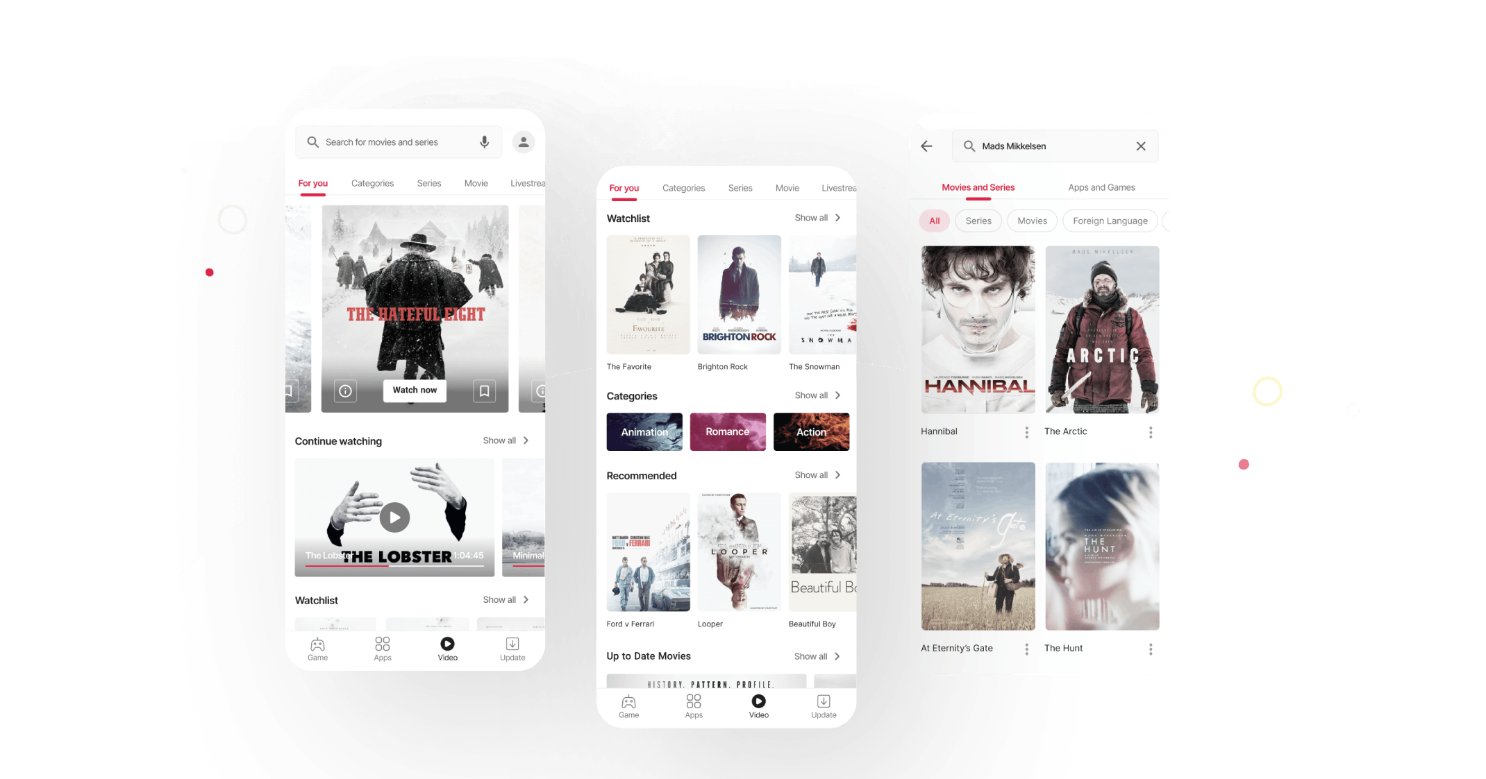
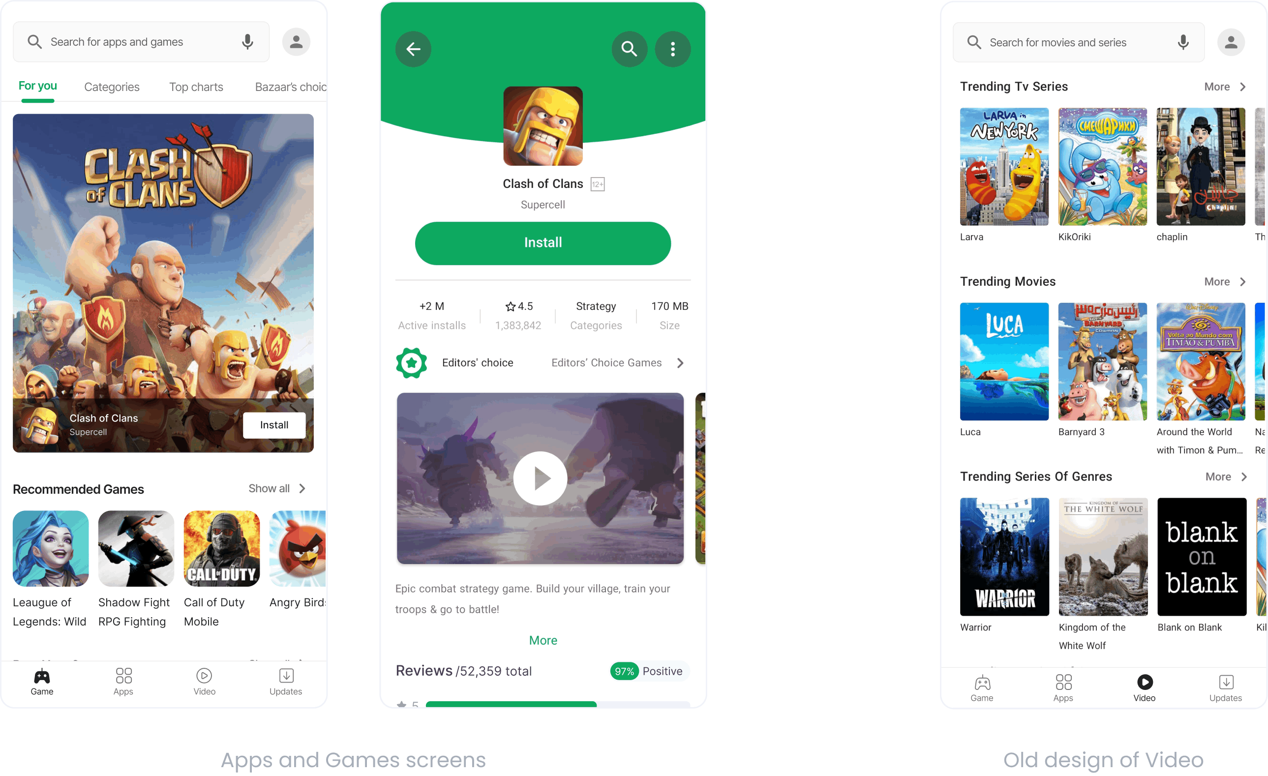
Cafe Bazaar is an Android application marketplace with more than 40 million users. Formerly, Cafe Bazaar offered only apps and games, and recently it added a video service to its product line to expand its offering.
Our biggest competitive advantage is the fact that we do not require a subscription fee and being free is a great user acquisition method since people are using it more and more each day.
Video

Problem Statement

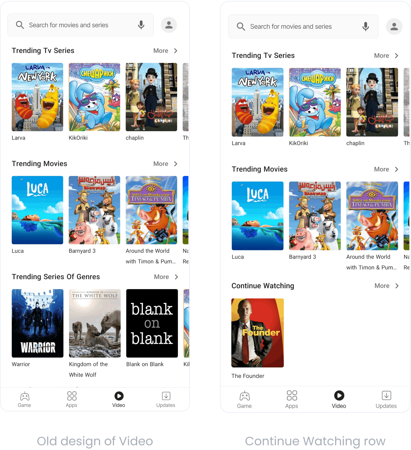
When you open Netflix, you are presented with a lot of exciting options to check out and it shows promotional content based on your tastes and preferences. Bazaar, on the other hand, was not like that. It would just display rows of videos without any differentiation among them. Our watch-times were unsatisfactory, partly because users didn't finish videos that they began. The second problem was that due to the short time-to-market, the components were obtained from Apps and Games services.

Video

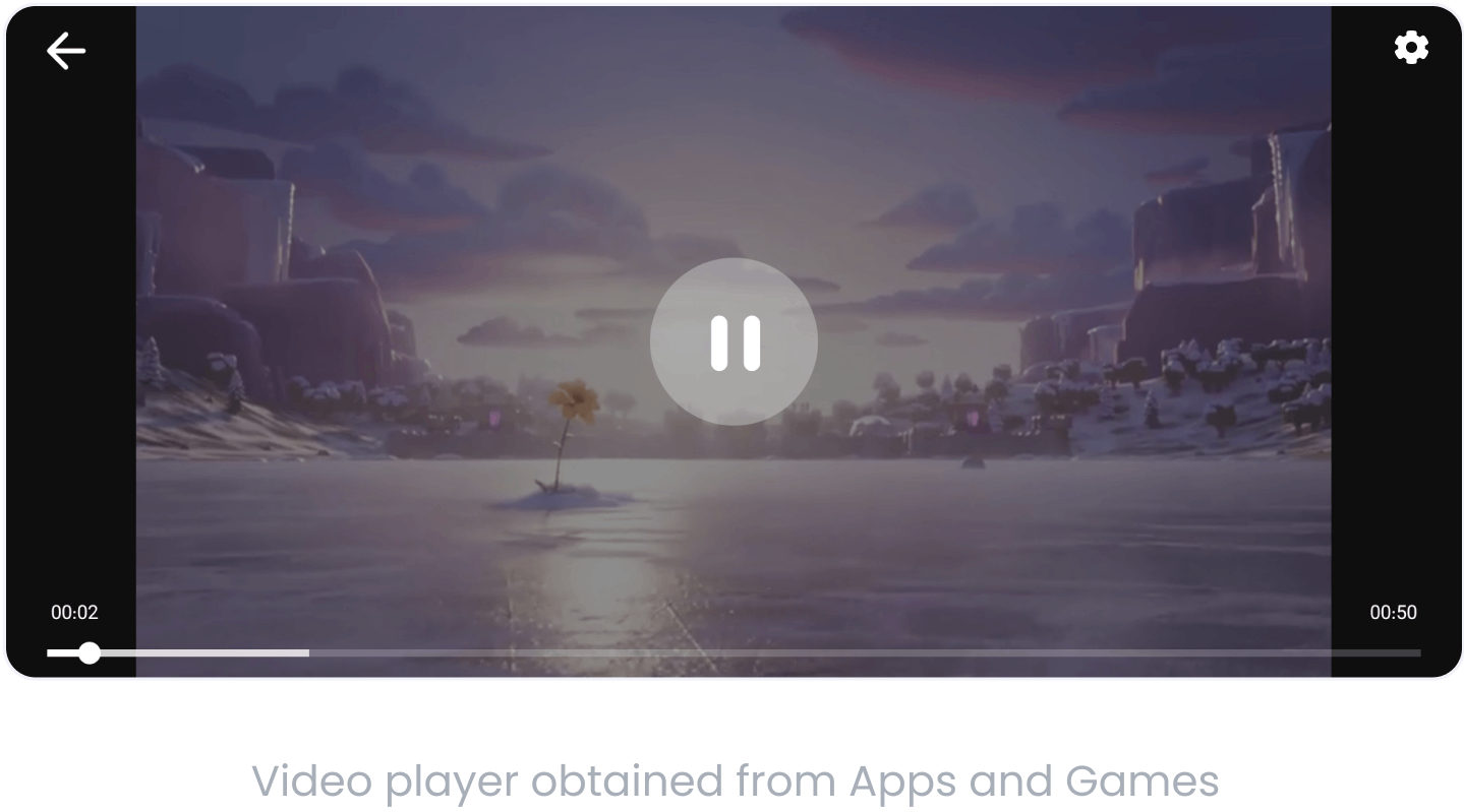
The player was also rudimentary, with just two settings. It was obtained from the Apps and Games section. Users were frustrated by the lack of options to choose quality, font size, and skip buttons.

Video

My Role

Since I was the only designer working on this project, I worked closely with the respective Product Managers to create the best experience for our users based on business needs.
As part of the design process, I first benchmarked competitors and different video streaming services (such as Filimo, Netflix, Peacock TV, etc) to understand how we can improve on the current design and where it falls compared to competitors.
Then we planned the project to be done in multiple phases, obviously for sustaining the iterative cycle and refinement process. During all of the phases I worked with two Product Managers, Backend, Mobile and Web Developers and the QA Team.

Exploration

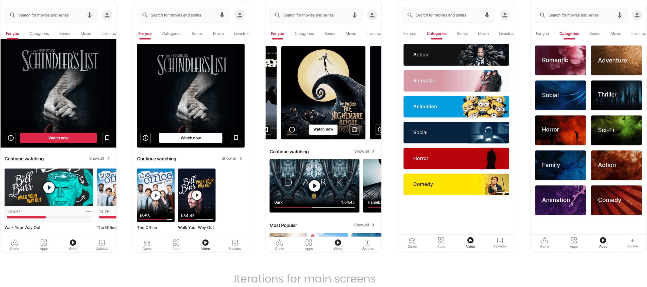
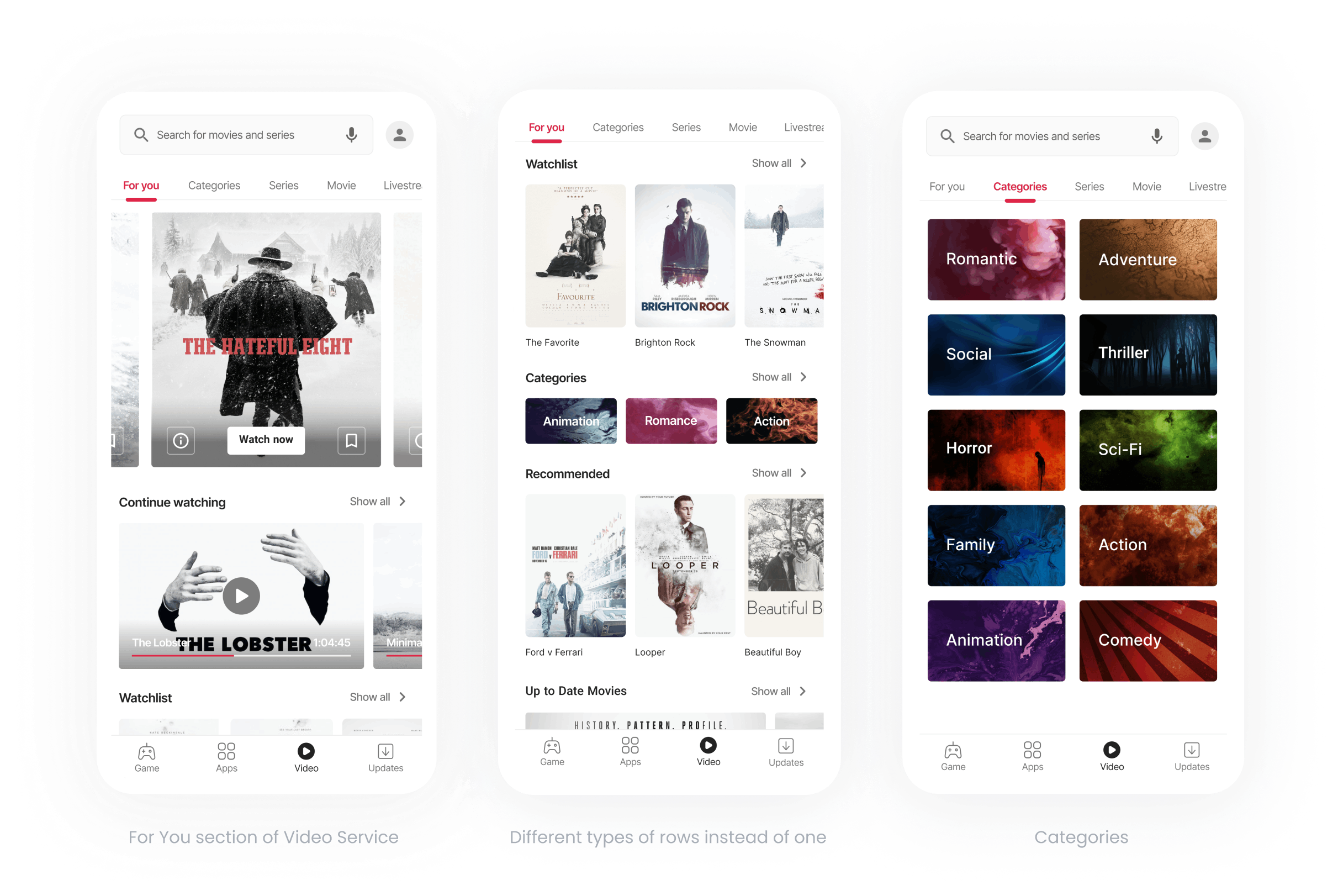
These are the iteration for the main screens. The promotional content at the top is one of the major differences, in addition, the continue watching row is easy to understand and is different from the others. The progress bar can also indicate how much time is left in the video.
Also tab bars have been added for content classification and better navigation.

Video

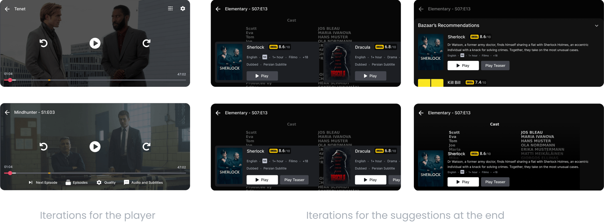
These are the iteration for the player. With the new layout, the options are more accessible and the skip button is also present. According to the benchmarking that was done, one of the ways that was popular for engaging the users was to show suggestions at the end of the video, so I did the same to see if it affected the watch time.

Video

Designs

Since it can promote more than one video at the top, we chose this version. In addition, the continue watching component could cover the screen if the user only had one in that section.

Video

I found that the movie posters were too small since the component was obtained from Apps and Games, and that people tend to remember movies and television shows by their posters rather than by their subheadings. Therefore, I made the posters larger than they were.
Additionally, by doing that, we decreased the cognitive load on users' minds by not showing so many posters simultaneously on each screen.

Video

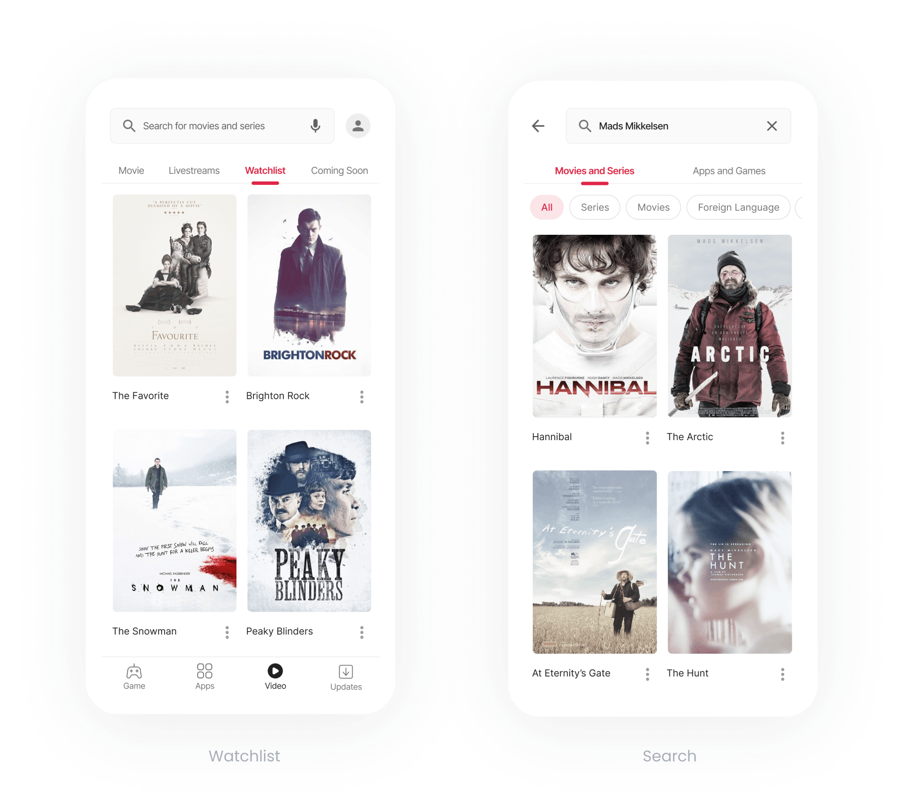
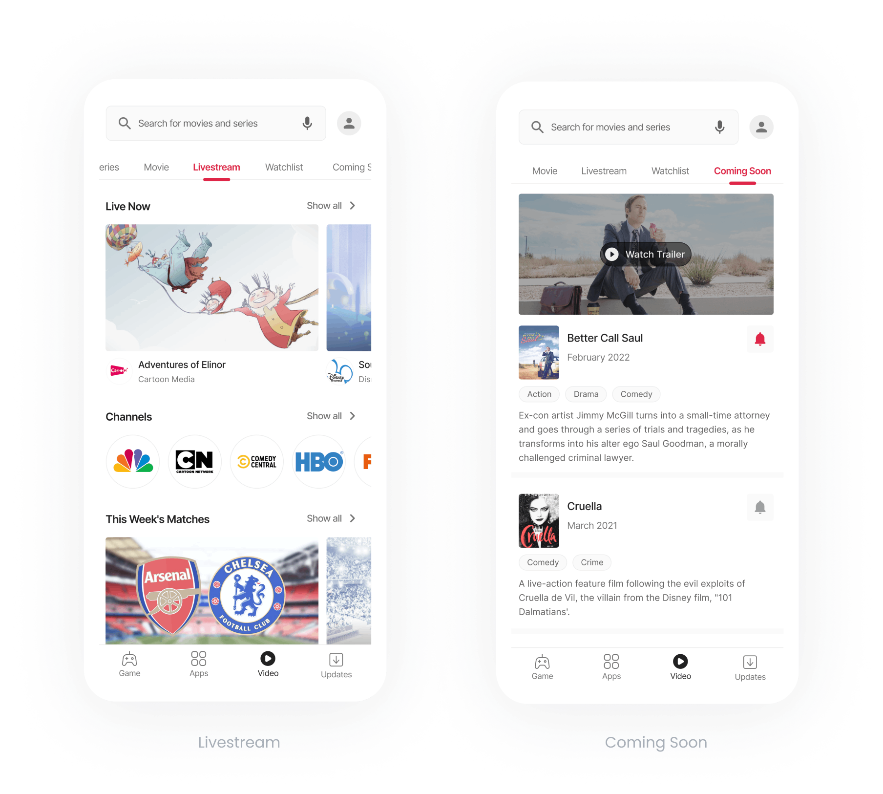
Our video service now offers two new sections:
Livestream: It contains any kind of online broadcast, including sports, cooking shows, TV shows, and more. Coming Soon: A place where we will promote the videos we intend to release on the platform.

Video

For the player, this one is easier to use since the user can easily figure out what options we offer and select the right one. With this design of recommendations at the end, we can suggest more than one video and it’s easier to scroll through.

Video

Two of the most requested features from users were the ability to choose quality of the video and save it as well as the ability to change the subtitle font size. These designs solve those problems.

Video

Results

In addition to improving Video's consistency with other services, the transformation has made our watch-times increase from 30 million minutes per day to 33 million minutes as a result of the new design and the new contents on our platform.
Following the implementation of recommendations at the end of videos, engaging users watched 1 more video on average.

What’s Next

The positive outcome has given us more motivation to explore what would make users more engaged, so we are going to show the progress of the watched video on its detail page, and if they have watched fully, a checkmark will be shown to them. Hopefully, this mini gamification will encourage them to come back and finish the video they began watching.

Other Projects

Would you like to see more of my work in Bazaar? These links will take you to a few of my projects:

Bazaar's Video Discovery redesign link

Bazaar's Video Detail redesign link

Bazaar’s web application redesigning link 1 link 2

A note taking app for the THA in the hiring process of Bazaar’s Android Team link