Beat Pickup Experience Improvement

Beat Pickup Experience Improvement Header Picture

Introduction

Beat was a ride hailing service focused on LatAm markets. It had more than 25 million users across 5 countries. I was one of the designers working on the passenger's experience.

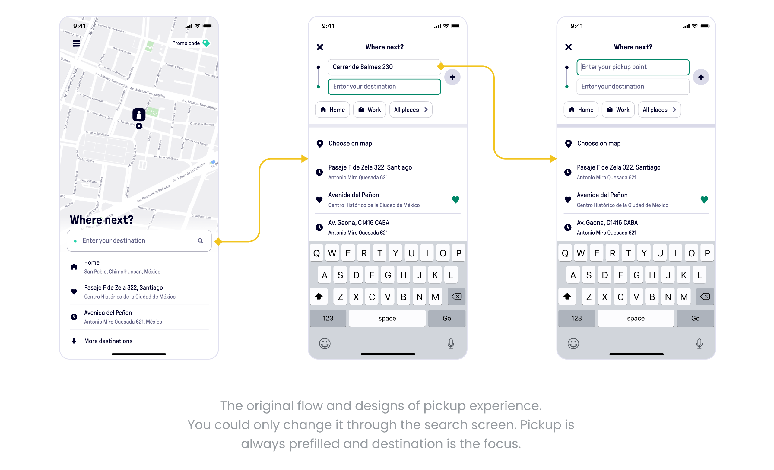
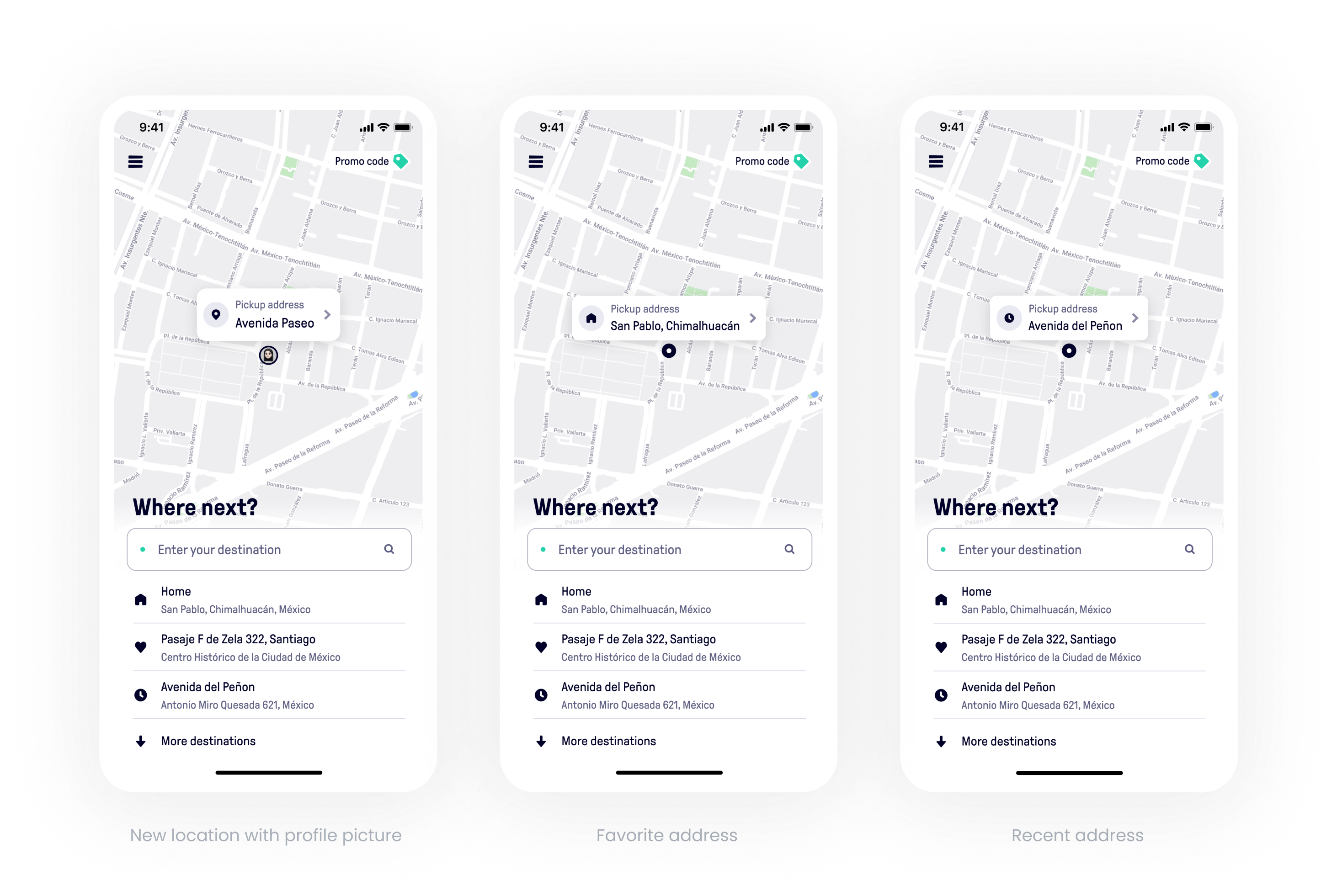
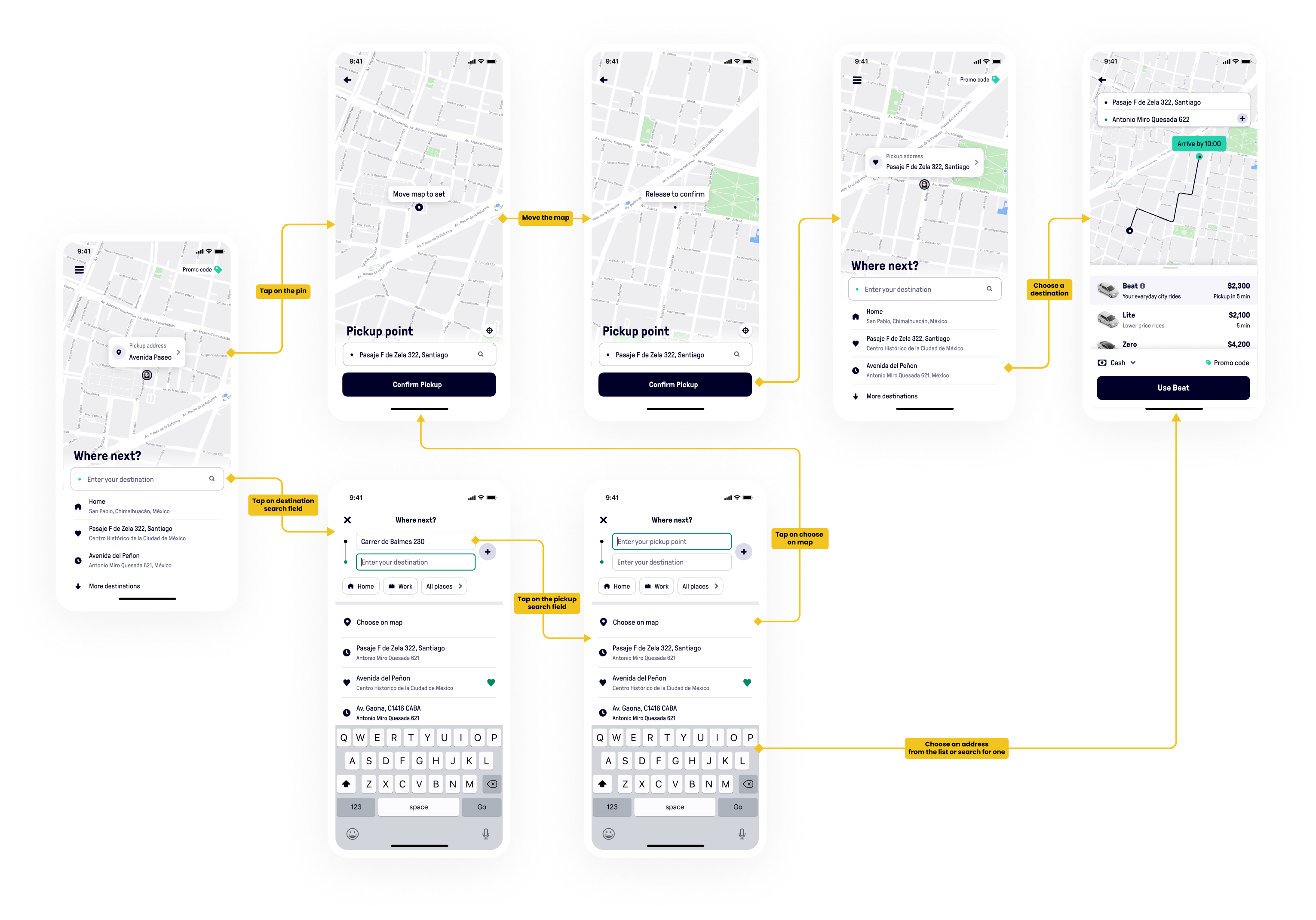
When you open a ride-hailing app, you are trusting the service to get your pickup location correctly. You don't want to think too much about it. The only thing you want to do is select your destination and get a ride.

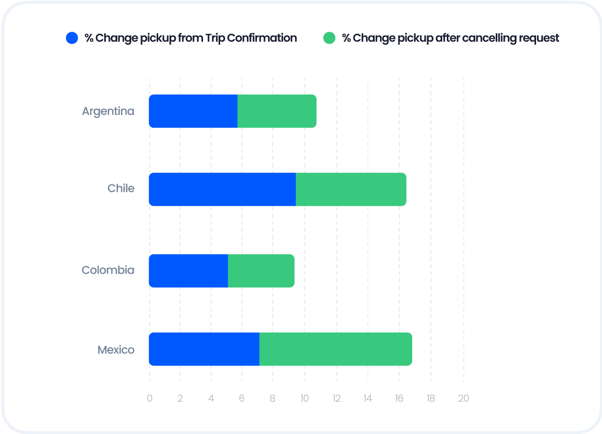
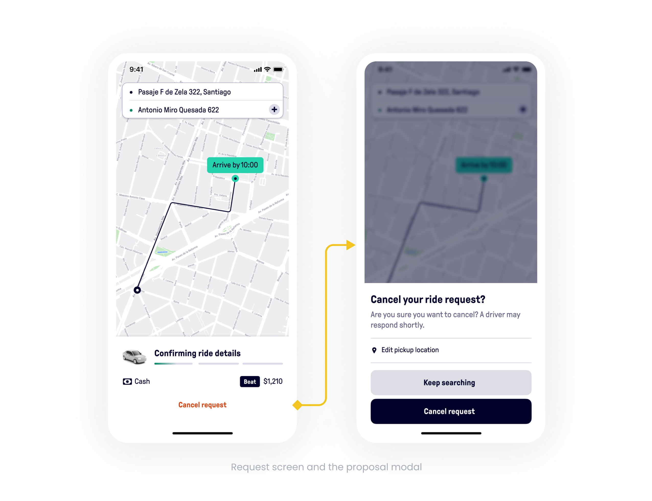
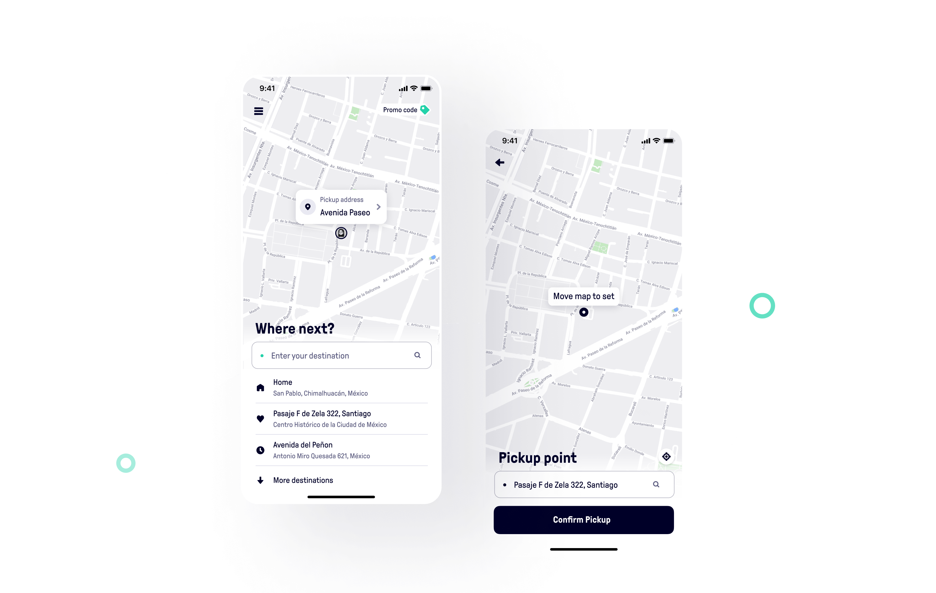
Well that was not the case with Beat! The pickup location was mostly incorrect because of GPS’s low accuracy in urban landscapes and our users have also complained about it several times in previous user researches. Therefore, it was vital to improve the experience when passengers choose their route. We have to ensure they’re gonna be picked up at the right spot and that drivers won’t have to waste time calling them or driving around the block to pick them up.

Beat Intro

My Role

I worked closely with the respective Product Manager and our Researcher to create the best experience for our users.

As part of the design process, I checked to see if there were any user insights about this problem that might help us. Firstly I jumped to our User Journey Map where we had added all the needs and pain points of our passengers. It gave us a better understanding of the whole picture and to think of a solution that impacts most of the funnel.

Problem Statement

From the User Journey Map we gathered that passengers mostly check their pickup address from the Trip Confirmation screen or on the Request screen. This was not good as it would lead the passengers to cancel their request to go back and change their pickup address.

One of the major problems with inaccurate pickup was because passengers relied on Beat to explicitly set a precise pickup location. This didn’t happen most of the time. So it caused drivers going to inaccurate locations, passengers getting wrong ETAs, and also prices being calculated incorrectly.

Our data revealed that:

  • 30% of users change their pickup after cancelling a request.
  • 20% of passengers that land on the Trip Confirmation screen change their pick up address.
Beat Chart

Ideation

It was clear that we needed to impact those numbers and make the pickup experience better. After a brainstorming session with PMs and Engineers, there were multiple great ideas like using live location, a step to confirm pickup location, using recents/favorites to snap the pickup location to that address, and showing the pickup address.

Based on feasibility and time to market the quickest way to tackle this issue was snapping pickup location to a recent/favorite address and also showing the pickup address on the map at the start of the flow.

Exploration

To explore our accepted idea, I benchmarked our competitors to get some perspective.

I wanted to design something without changing the current design drastically so we could have a faster time to market. So I came up with these iterations for showing the pickup address on the map.

Beat Exploration

Research

Having finished the designs, I handed the prototypes over to the researcher of the team to put them through some usability tests. Usability tests helped us see if users understood when their pickup is wrong and how to change it. I wrote the scenarios for the tests, and also questions to be asked from the users.

Testing revealed that users failed at all steps of the flow. Neither of them saw the new pin nor the address in it. When they were told about the feature, they still couldn't read the address due to the small size of the address badge. They did not realize they could tap on it. Thus, it was time to consider another approach to the design.

Reiteration

After analyzing the results of the test, I concluded that we might be able to grab passengers’ attention if we show something new, bold, and different on the map. As a result, I began iterating on a new design.

Beat Reiteration

Design

After several feedback sessions with UX team, PM, and engineers, I selected the following version as the final design. However, it was time to test them again to make sure that we had hit the nail on the head this time.

The new pickup pin was well received after the second round of usability tests. Seven out of nine people were able to understand and use it and they actually loved the icons we showed on the pin, they said it made it clearer if you’re at home and assures you have the right pickup.

Beat Design

Flow of changing pickup address

We added a new, clearer, and more intuitive touchpoint for changing pickup addresses, while also retaining the original.
As a first touchpoint, we have the pickup pin on the map. Another option is to tap on the search field for destination, then tap on the pickup field to either write and search your address or select it on the map.

Beat Flow

Results

The new pickup experience resulted in a 12% reduction in passengers changing their pickup address on the Trip Confirmation screen and a 3% reduction in cancellations due to incorrect pickup.

What’s Next

The time to change pickup increased by 10%, which is not good and it was due to opening the Choose on Map screen. To decrease the number we wanted to try to open the Search screen with the addresses list instead.

Another improvement would be to allow passengers to alter their pickup address on the Request screen instead of canceling the entire request when an incorrect pickup occurs.

Beat What’s Next

Other Projects

Would you like to see more of my work in Beat? These links will take you to a few of them:

A few screens of the Favorite Address feature link

Some of the illustrations I made for Beat link